
6 Diagnostics for Pipeline Problems
An analysis framework for finding missing pipeline.


Recently Andrew Chen, partner at Andreessen Horowitz, published a newsletter titled Every marketing channel sucks right now. It’s geared towards early stage marketing but still worth a read because he talks about the forces that ultimately cause every marketing channel to decay towards worse ROI over time.
This is part of why so many teams are trying to get their inbound-heavy teams to do more outbound. As expensive as your sales team is (and trust me they’ve gotten more expensive), it costs a lot to live off inbound. At some point you have to get proactive instead of reactive in engaging your market so your pipeline doesn’t dry up.
Whether it’s going outbound for the first time or trying to fix a prior half-assed approach to outbound, it can be daunting to figure out what to change to ensure you’re controlling your destiny and generating the pipeline you need.
As it turns out, this is often where companies find themselves when we talk to them about Gradient Works and our pipeline platform. It’s so common that we’ve developed a framework for analyzing data, diagnosing issues and recommending changes. We call it a Coverage Analysis.
We usually deliver it as a pretty hefty slide readout during our sales process. It’s been eye opening for many of our customers and we usually receive very positive feedback. So, I thought I’d share the framework and analyses here to help folks who want to roll up their sleeves and go DIY on it.
We break the Coverage Analysis into 4 parts (and 6 different diagnostic analyses):
Rep Books - review the current state of account assignments for fairness and effectiveness
Rep Effort - review how reps work the accounts assigned to them
Market Coverage - review whether the team is actually directing effort towards the right accounts
Outcomes - review how efficiently the team converts effort into pipeline and pipeline into closed/won deals
Before I get started, a word of warning. You might want to pull in an analyst for this one. A few of these analyses require some data elbow grease to build.
Let’s dig in.
Rep Books
The purpose of this analysis is to get a sense of how books (or territories) are structured today. In particular you want to understand whether books are properly sized, whether account potential is evenly distributed, and whether book sizes have any meaningful impact on performance.
This analysis is especially useful for organizations that have taken a more “organic” approach to books in the past. For example, inbound-driven organizations may have been round-robining accounts to reps for years. In that case, long-tenured reps often hold many more accounts than others. Those accounts also tend to be higher quality (e.g. Microsoft came inbound 2 years ago and belongs to Joe because he was next up in the round robin that day in 2023).
There are two key analyses here:
Book Composition by Dimension - this helps you visualize whether books are actually created equal
Book Size vs Opportunity Creation - this helps you see where books sizes become too large and start producing diminishing returns
Book Composition by Dimension

What it shows: Each column represents a breakdown of a rep’s book of accounts into groups (aka “dimensions”) that matter to you. Dimensions are typically things like segment, industry, tier, revenue band, etc. In the example above, the dimension is account segment. The total size of the column is the quantity of accounts in each rep’s book.
What to look for: Ideally books look pretty uniform for reps with similar roles—both in size and breakdown by dimension. This is not the case in the example. Note how the 5 Americas reps have very differently sized books. The first rep (ending in 36AAF) has a lot of Unknown accounts while the 4th rep (PQAA2) has far more SMB accounts than the others. There are some serious imbalances here.
How to calculate it: Export a report of all accounts with their associated owner to a spreadsheet. Make sure each dimension is available for each account. Use a pivot table with rows as owners and the dimension values as columns. In the example above, the dimension is “Segment”. From there, create a stacked column chart of the pivoted data. Do this to make separate charts for all the dimensions you care about.
Book Size vs Opportunity Creation

What it shows: This helps you understand the point at which increasing book sizes yields diminishing returns. This always happens—at some point more accounts don’t help reps and actively start hurting them. It’s something I call the “pipeline plateau” which I’ve covered in much more detail previously. The x-axis (horizontal) shows how many accounts are in the rep’s book and the y-axis (vertical) shows how many opportunities they’ve created. Bubble size is based on their average activities per account.
What to look for: Look for where the relationship between book size and opportunities stops going up and starts flattening out. This is a good place to start when considering shrinking territories/books. In this example, we can see that reps generally work accounts with the same intensity (similar bubble sizes) but that the number of accounts in their book has no bearing whatsoever on how many opportunities get created (the green bubble is an obvious outlier—in this case due to a specialized role handling inbounds).
How to calculate it: Getting the data for this one is a bit more complicated. You’ll need a rollup of accounts, activities and created opportunities by rep. We use python to do this, you can do much of it with a few Salesforce reports. Once you’ve got the data in that format, you can create a bubble chart (Excel, Google Sheets) to get something similar to the result above.
Rep Effort
The next step in the analysis is to determine whether reps are actually putting in the work and attempting to fully engage their books. This is less about being sure that reps are doing a set number of activities and more about understanding how they’re working the accounts they’re assigned.
Book Coverage - helps you visualize what percentage of assigned accounts reps are actually working
Engagement Style - helps you visualize whether reps are doing enough activity and multi-threading per account they engage
Book Coverage

What it shows: Whether reps are actually working the accounts they’ve been assigned.
What to look for: Generally speaking, coverage should be 80-90%. Basically the exact opposite of the example. If—like the above example—they don’t come anywhere close, you should ask yourself whether it makes sense for them to have that many accounts in the first place. (Hint: smaller dynamic books are probably better, especially for commercial sales teams.) If coverage is low as a percentage, you want to dive into activity levels to understand if reps aren’t doing enough or if their books are too large to effectively work.
How to calculate it: Pick a time period and an amount of activity you believe constitutes coverage. The above example is the last 12 months and considers just a single activity to count as “coverage”. Obviously that’s a very lenient definition. Your goal is to count up the unique accounts owned by the rep with at least N activities performed by that rep. My personal preference for doing this is to export a data set of all activities and accounts so you can use a BI tool, python or SQL to do the calculation. If you’re not into that, you may be able to get there with an Activities and Accounts report in Salesforce. Once you’ve got that number, all you need is a stacked column chart in your favorite spreadsheet tool on a data set where each rep has columns for total accounts and engaged accounts.
Engagement Style

What it shows: The x-axis (horizontal) shows multi-threading—the number of contacts engaged per account. The y-axis (vertical) shows the number of activities the rep performed per account. The size of the bubble is the total number of accounts held by that rep. In the example, reps are working accounts somewhat deeply (> 20 activities per account) but are not multi-threading very much (< 2 contacts on average). This paints a picture of reps that are are doing a lot of single-threaded effort.
What to look for: You’ve probably coached your reps on the kind of engagement you want to see. That often takes the form of a statement like “15 touches each for 3 contacts”. In that case you’d expect reps to cluster somewhere near those values on average. If you see very low levels of activity per account, that likely means reps are spraying and praying1.
How to calculate it: You can do this one with data from an Activities and Accounts report in Salesforce. If you export data containing the account id, activity id and contact id (aka “who_id”) to a spreadsheet, you can do a pivot table with the reps as the rows, a distinct count of accounts, activities and contacts. After that, it’s bubble chart time again.
Market Coverage
It’s surprisingly difficult for most sales teams to answer a pretty simple question: Are reps actually working the accounts we’ve identified as good? This analysis answers that at a team level.
Whereas the prior parts of the analysis looked at specific rep books and behavior, this analysis looks at overall engagement levels for specific kinds of accounts across all reps.
You’ve probably done a lot of work as team to tier accounts or otherwise instructed your reps to focus on specific industries, segments, company sizes, etc. This shows whether that’s happening.
The key tool for this is the engagement grid. I’ve written about this in more detail in 3 Outbound Metrics CROs Need, but I’ll revisit it here.
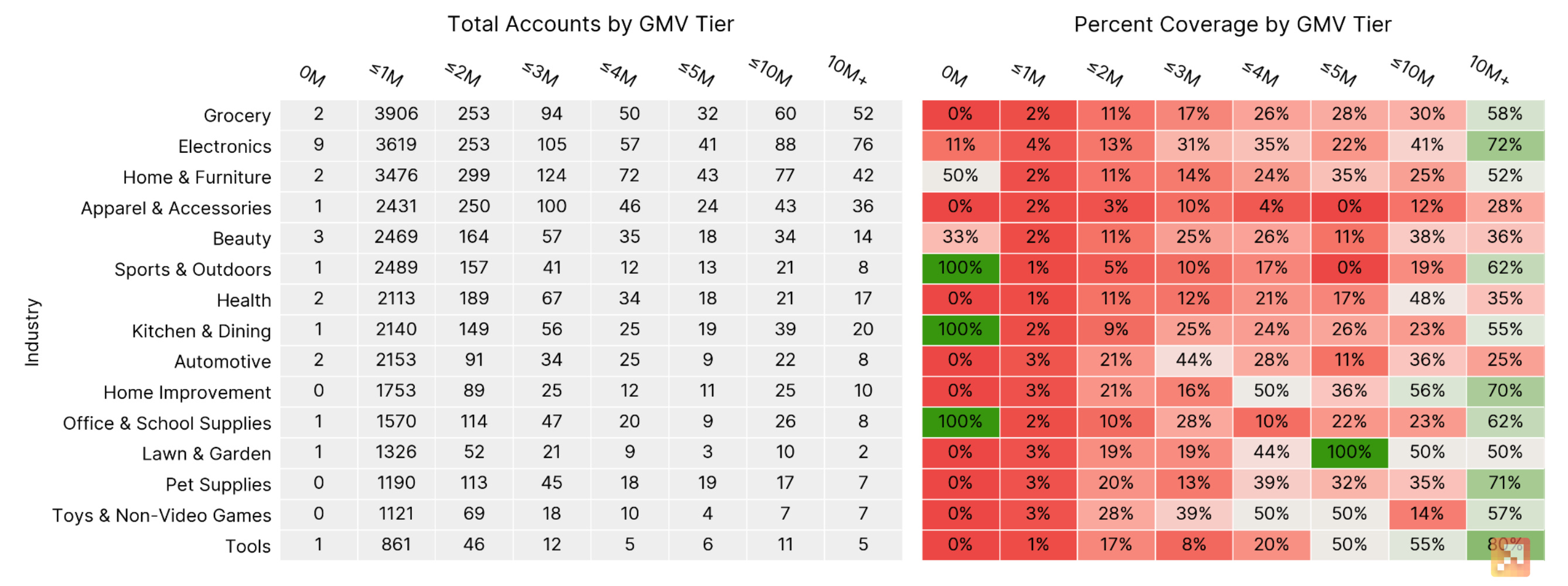
What it shows: Given two dimensions (e.g. industry and GMV tier in the example), it shows you how a) how many accounts exist and b) what percentage of those accounts your team has engaged. You can run this for any pair of dimensions and see where the team is focusing. Cells in green are where the team is fully covering the accounts, dark red are areas where they’re not spending any time.
What to look for: Coverage gaps. Let’s say you’ve told reps to focus on Tier 1 accounts in Financial Services. If you see that cell is deep red, you know that your strategy isn’t translating to execution. Another common thing we see is that the whole grid is sort of a light red. That means reps aren’t focusing in any particular area. That’s usually a sign they need help prioritizing.
How to calculate it: Decide what number of activities you consider to be engagement. You can go as low as one but I generally prefer 3-5. Grab the good old Activities and Accounts report for a period you care about and count up activities by account. Flag every account with more than N activities as engaged by putting a 1 there. (You can do this with a spreadsheet formula or a Saleforce report summary formula.) From there you’ll want to join that with a list of your accounts (using a vlookup or similar). Then it’s time to generate a pivot table using one dimension for rows and another dimension for columns (e.g. industry and GMV tier in the example). To derive the percentages you’ll need to sum the total engaged account flags and divide by the total accounts. You can get the coloring using conditional formatting in your spreadsheet.
Outcomes and Opportunities
The new business part of a GTM org is responsible for two outcomes (that map to the two sales questions):
Creating Pipeline - in this part of the funnel, rep effort is converted into potential opportunities to close business. While you can measure later-stage pipeline in dollars, I think it’s usually better to measure this early stage pipeline in terms of counts.
Winning Deals - in this part of the funnel, rep effort is converted into actual closed/won opportunities that represent revenue. I also typically look at this on a count basis, not a dollar basis. That way one 100k win doesn’t make 10 $10k losses disappear.
This final part of the analysis is to help you identify where you do well (or don’t) against either of those goals. It compares the opportunity creation rate (i.e. prospecting efficiency—how well you create potential deals) vs the win rate (i.e. sales efficiency—how well you close deals).
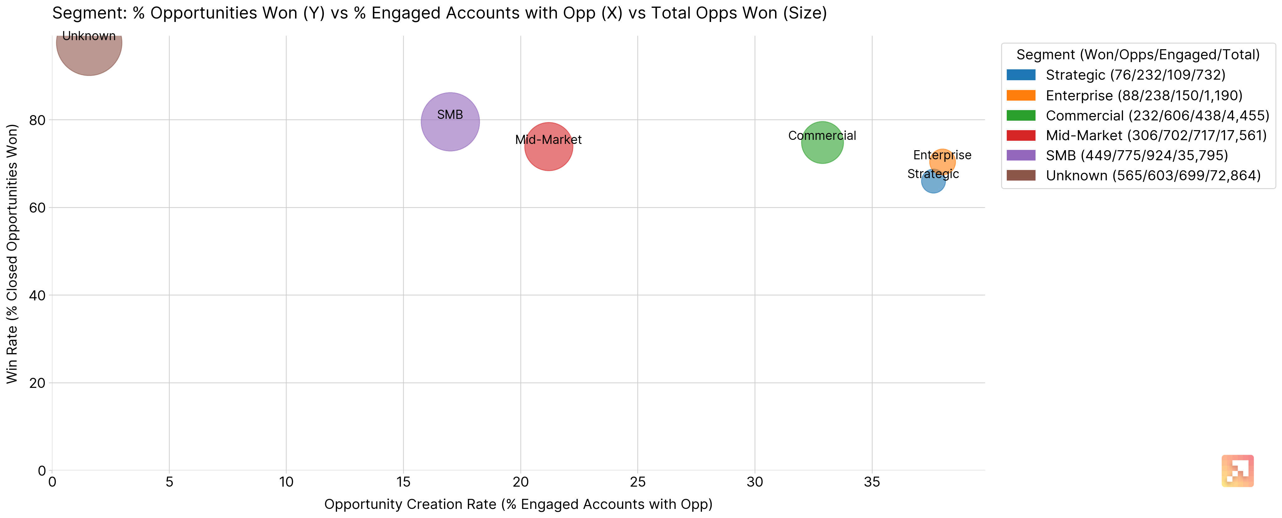
What it shows: Each bubble is a particular dimension value. In the example above, each bubble represents outcomes for accounts in a particular segment. You could do it for any dimension that’s important to you—industry, revenue tier, etc. The x-axis (horizontal) shows the opportunity creation rate—the farther right, the more efficiently you create opportunities. The y-axis (vertical) shows the win rate—the higher up, the more efficiently you close deals. The bubble size is the total number of opportunities won. This helps differentiate flukes (e.g. a small sample size) from more consistent performance.
What to look for: Bubbles that cluster towards the top right are the best. They’re they easiest to create pipeline from and the easiest to close. Those are the best places to double down. In the above example, Enterprise and Strategic are the easiest to set meetings for, but SMBs close at a higher rate. That’s the reverse of the usual trend we see. If you see a bubble that’s easy to close but hard to set meetings with, you may want to revisit your approach to outbounding to that group of accounts. If you see a bubble that’s easy to set meetings with but hard to close, you may2 want to spend less time outbounding to that group.
How to calculate it: I really do recommend more than a spreadsheet for this one. You’ll probably want a BI tool, python or SQL. You can take the same account engagement logic you used for Market Coverage to figure out which accounts have engagement. Then you need to get an export of all your opportunities by account and join that up as well. The end result is that you can break down accounts by dimension and count up unique engaged accounts as well as unique opportunities on those accounts. At least calculating the win rate is pretty easy. Once you’ve got all that, it’s bubble chart city one more time.
Wrapping Up
Don’t say I didn’t warn you that this one was was going to get a little deep in the data weeds.
Setting aside the underlying data wrangling, the idea is to give you a strategic picture of where and how your team could improve. Are there issues with poor book design, insufficient rep effort or misplaced focus on the wrong accounts? From there, the outcomes analysis helps you figure out where you could spend more time to achieve more efficiency at creating and closing pipeline. And if you can do that, you’re giving yourself the best shot to hit your number.
Happy diagnosing.
It could also mean they’re not doing much activity at all. You can determine that from simple activity reports.
This is where you should consider the economic value of these wins. Perhaps they’re all really big deals. You should also consider whether there are places where you’re falling down in the sales cycle with this group. If it’s easy to set meetings your value prop is resonating but perhaps your product doesn’t deliver or you’re failing to reach a decision maker.